About Me
Hi, I’m a data analyst who loves finding the story behind the numbers. Skilled in SQL and Power BI, I turn data into insights that help people make better decisions. I enjoy exploring patterns, solving real problems, and creating reports that actually make an impact.
Skills

Excel | SQL | PowerBI | Tableau | Python | R
Excel - 5 years +
SQL- 2 years +
PowerBI- 2 years +
Tableau- 1 year +
Python- 2 years+
Team Management- 4 years+
Featured Projects
Classic Models
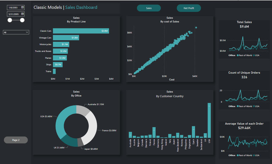
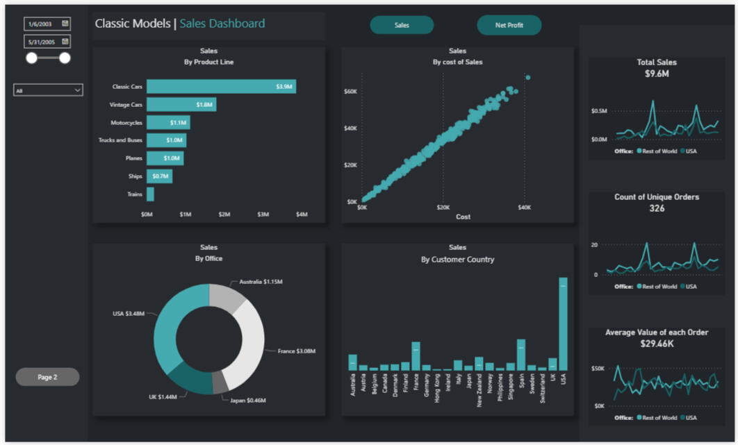
In this project, I worked as a Data Analyst using the Classic Models database to deliver insights on products, customers, sales, and operations. By creating SQL views and analyses, I helped the executive team make data-driven decisions through Power BI reports focused on performance, profitability, and risk.
*Please note that you can download the files on the project link
Stature Leadership
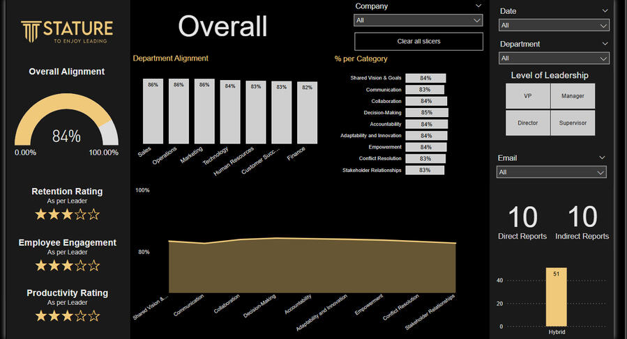
An interactive Power BI dashboard was created to analyze leadership survey data by converting qualitative responses into measurable metrics. It provides visual tools to assess leadership alignment across teams and leadership levels.
*Please note that you can download the files on the project link
Other Projects
Thank You
Contact Me
If you would like to chat about me joining your team, feel free to email me using the form below 👇
SQL, Excel, Power BI | Classic Models
Key InsightsThis project strengthened my ability to combine SQL querying, Excel validation, and Power BI visualization into one cohesive workflow.
It reinforced how data storytelling can reveal risks, improve financial decisions, and build trust across departments — a key skill I bring into every business analysis project.
OverviewThe Classic Models project explores customer financial behavior, payment patterns, and credit exposure within a global sales dataset.
Using SQL, Excel, and Power BI, I built an end-to-end analysis that identifies customers with outstanding balances, tracks payment performance, and flags those exceeding their credit limits.The goal was to give management a clear, data-driven view of sales performance and financial risk — helping them make informed decisions around credit control and customer engagement.
ObjectivesEvaluate each customer’s total sales, payments, and outstanding balance.Identify customers who have exceeded their credit limits.Visualize sales and payment trends by region, product line, and customer type.Strengthen financial decision-making through data insights and transparent reporting.
Tools and Methodology1. SQL (MySQL)SQL served as the foundation for data extraction and modeling.
I developed multi-layered Common Table Expressions (CTEs) and used window functions like LEAD() and SUM() OVER() to calculate cumulative sales, payments, and balances for each customer.This made it possible to identify, in real time, which customers had surpassed their credit limits and how much they owed.Key Features:Joined multiple tables — Orders, OrderDetails, Customers, and Payments — for full transaction visibility.Created dynamic calculations for:runningtotalsales – cumulative customer salesrunningtotalpayments – cumulative payments receivedmoney_owed – outstanding balancedifference – remaining credit limitThis SQL foundation ensured accurate, reliable data before analysis in Excel and Power BI.
## breakdown of each customer and their sales, but include a money owed column as I would like to see if any customers have gone over their credit limit.
with
ctesales as
(
SELECT
t1.orderDate,
t1.orderNumber,
t3.customerNumber,
t3.customerName,
t2.productCode,
t3.creditLimit,
quantityOrdered * priceEach as salesvalue
FROM orders t1
inner join orderdetails t2
on t1.orderNumber = t2.orderNumber
inner join customers t3
on t3.customerNumber = t1.customerNumber
),runningtotalsalescte as
(
Select , lead(orderdate) over (partition by customernumber order by orderdate) as nextorderdate
from
(
SELECT
orderDate,
orderNumber,
customerNumber,
customerName,
creditLimit,
sum(salesvalue) as salesvalue
FROM ctesales
group by
orderDate,
orderNumber,
customerNumber,
customerName,
creditLimit
) subquery
)
,paymentscte as
(
Select *
from payments
),main_cte as
(
select t1.,
sum(salesvalue) over (partition by t1.customernumber order by orderdate) as runningtotalsales,
sum(amount) over (partition by t1.customernumber order by orderdate) as runningtotalpayments
from runningtotalsalescte t1
left join paymentscte t2
on t1.customernumber = t2.customernumber and t2.paymentdate between t1.orderdate and case when t1.nextorderdate is null then currentdate else nextorderdate end
)SELECT *, runningtotalsales- runningtotalpayments as moneyowed,
creditlimit - (runningtotalsales- runningtotalpayments) as difference
from main_cte
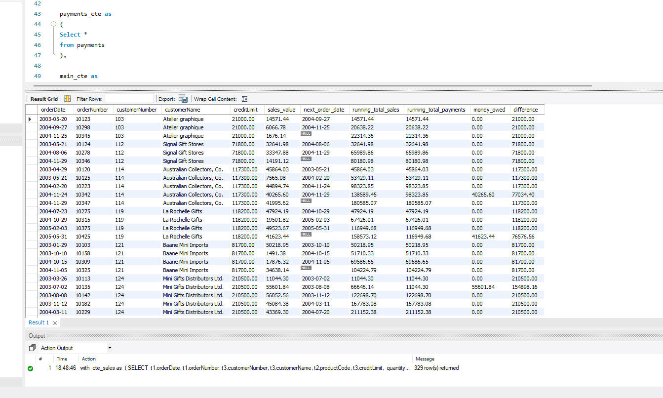
2. ExcelExcel was used as a validation and exploration layer before integrating data into Power BI.
I imported SQL outputs to verify data consistency, detect anomalies, and summarize results using pivot tables.Key Steps:Built pivot tables to summarize total sales and money owed by region, product, and customer.Used conditional formatting to highlight overdue accounts and over-credit customers.Created custom logic to check financial thresholds:=(@runningtotalsales)-(@runningtotalpayments)
=(@creditLimit)-((@runningtotalsales)-(@runningtotalpayments))
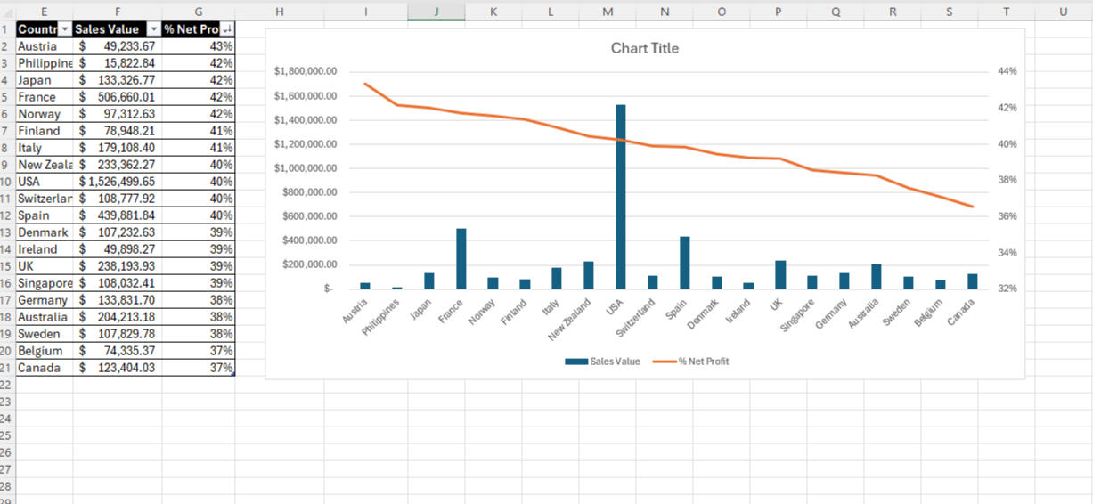
Excel acted as a quality checkpoint, ensuring every metric passed consistency checks before visualization.
3. Power BIPower BI transformed the validated dataset into a visual, interactive dashboard for decision-makers.
The dashboard provided real-time insights into credit risk, sales performance, and regional payment behavior.Dashboard Highlights:KPIs: Total Sales, Total Payments, Outstanding Balances, Over-Credit CustomersVisuals:Bar chart – Sales vs. Credit Utilization by CustomerLine chart – Monthly Sales & Payments TrendsMap visual – Customer Distribution by RegionFilters: Country, Product Line, Sales Representative
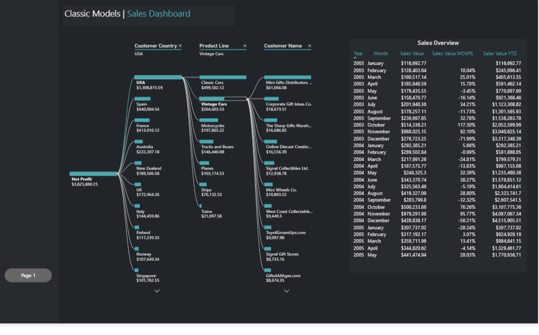
These visuals made it easy to drill down into customer segments and spot emerging credit risks or sales opportunities.
Key InsightsIdentified customers exceeding credit limits, allowing for proactive follow-up.Found that customers with higher credit limits contributed disproportionately more to total sales.Highlighted payment delays and outstanding balances across different countries and offices.Improved transparency and collaboration through data-driven dashboards that simplified financial tracking.
Power BI | Stature Leadership
Key Insights & ReflectionFrom a storytelling perspective, this project illustrated how data can spark human reflection.
Each visual told part of the story — showing not who was right or wrong, but how perspectives differ and what that means for collaboration.
The dashboard became a conversation piece, encouraging leadership teams to use data as a mirror rather than a scorecard.This project deepened my understanding of how analytics can drive change in people-focused environments.
It reinforced key lessons:Data storytelling is about empathy: presenting numbers in a way that respects human context.Visualization builds trust: clear, honest visuals invite meaningful dialogue.Leadership data is relational: alignment metrics only matter when they lead to shared understanding and growth.By blending analytical precision with emotional intelligence, I learned how to create stories that inform, connect, and inspire.
OverviewThis project was developed in collaboration with Stature Leadership, an organization focused on enhancing leadership effectiveness and organizational culture.
The goal was to analyze and visualize leadership alignment across multiple dimensions such as communication, strategic vision, collaboration, and trust.Using Excel and Power BI, I transformed raw survey responses into a meaningful story—one that revealed how leaders and their teams perceived alignment across key organizational values and operational priorities.
The project combined data analysis with human insight, highlighting the power of storytelling in analytics.
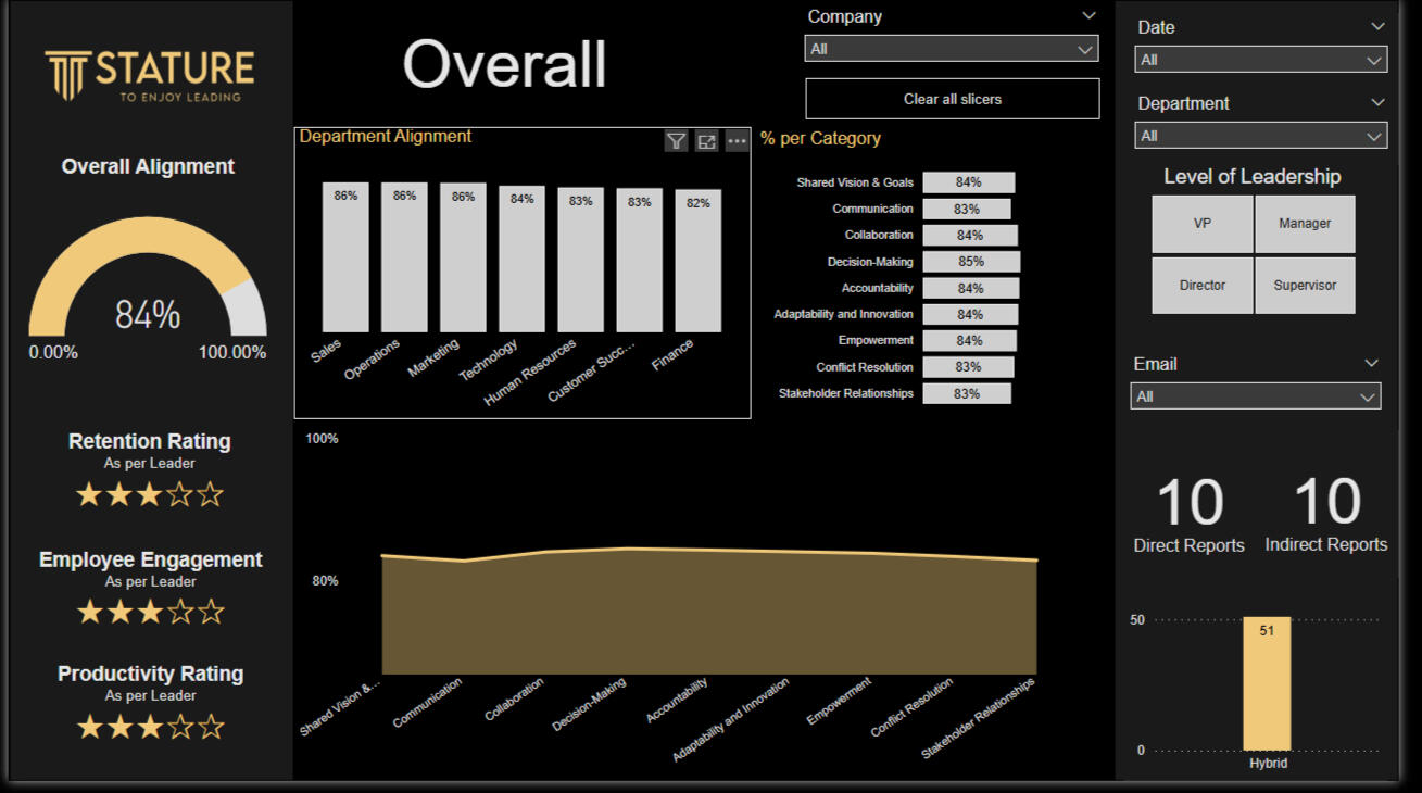
ObjectiveTo evaluate and visualize the degree of alignment between leaders and team members across different organizational attributes.
The purpose was not just to report scores, but to uncover where perceptions diverged, why misalignment may exist, and how leadership teams could act on those insights to build stronger communication and unity.
Tools and Methodology
1. Excel
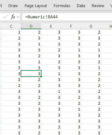
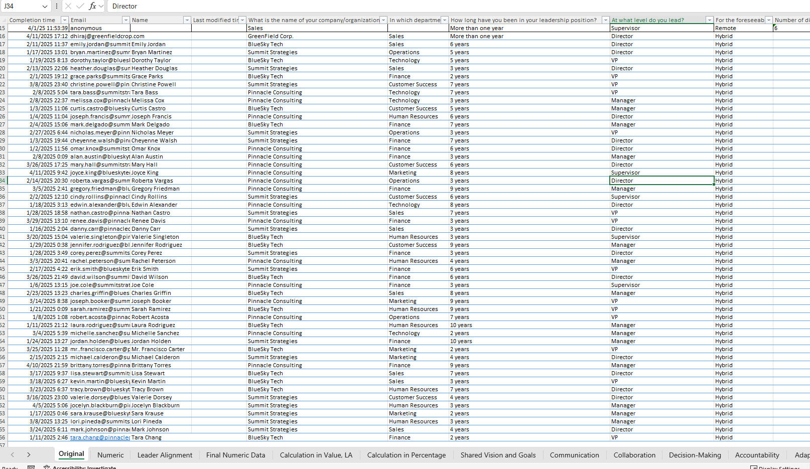
*Above is a tutorial for how the Excel file was created and how you can work with it.
Excel served as the foundation for data preparation and quality control.
The dataset contained several sheets, including Final Numeric Data, Leader Alignment, and dimAttribute mappings for coded categories (e.g., 10.1, 10.2).Key Steps:Data Cleaning: Removed blank entries, ensured consistent formatting, and aligned attribute codes with descriptive labels.Unpivoting Data: Transformed wide-format survey results into a long format suitable for relational modeling.Attribute Mapping: Merged numeric codes with attribute names to create a human-readable dataset.Validation: Checked for logical consistency between leader and team responses to ensure accurate comparisons.This phase ensured that every score carried context—each number representing a real perception about leadership or culture.
2. Power BI
*Above is a tutorial for how the Excel file was created and how you can work with it.
Power BI was used to turn the prepared dataset into a story-driven dashboard.
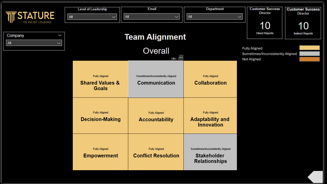
It visually presented the degree of alignment between leadership and team perspectives, allowing decision-makers to see both strengths and gaps in one glance.Dashboard Highlights:Overall Alignment Score: Displayed as a KPI card summarizing total leadership alignment across all attributes.Category Breakdown: Bar charts visualized scores by themes—such as communication, shared vision, and team culture.Leader vs. Team Comparison: Showed where leaders rated themselves higher or lower than their teams.Interactive Filtering: Allowed users to explore results by department, region, or leadership category.Data Model Design:Final Numeric Data connected to dimAttribute through attribute codes.Leader Alignment acted as a lookup table to segment scores by leadership dimension.Relationships were managed using a star schema for optimal report performance.The visual design emphasized clarity and empathy—each chart encouraging discussion rather than judgment.
Data StoryThe narrative behind the data revealed both alignment and divergence.
While leaders and teams were strongly aligned on strategic vision and organizational purpose, there were subtle differences in how each group viewed communication consistency and feedback culture.The dashboard made these differences visible—not as gaps, but as opportunities for conversation.
By focusing on “alignment trends” rather than raw scores, the visualization helped stakeholders shift the dialogue from “who is right” to “how can we improve together.”
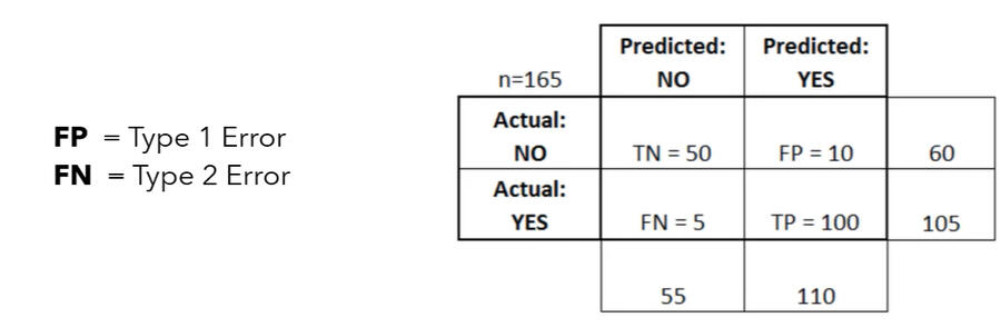
Advertising Click Prediction (Logistic Regression)
A classification model was developed to predict whether a user would click on an online advertisement based on demographic and behavioral features. The project demonstrates end-to-end data preprocessing, logistic regression modeling, and evaluation to support targeted marketing strategies.
Social Network Analysis
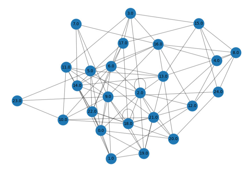
This project applies social network analysis techniques to identify influential users and structural patterns within a network. Using centrality measures and network visualization, it uncovers key individuals who drive information flow and highlights the underlying community structure.